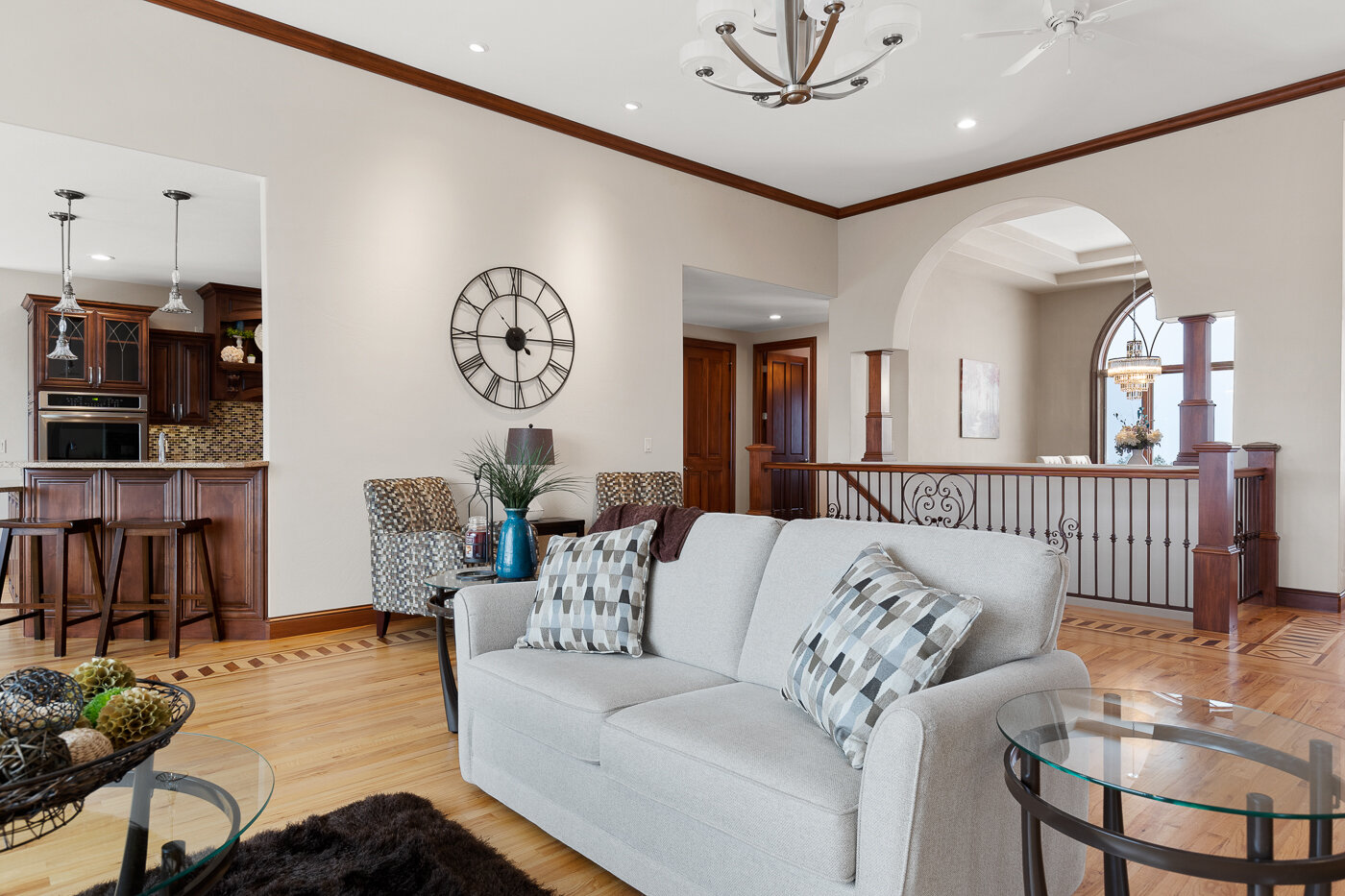
Dos and Don’ts of Living Room Furniture Placement
There are so many things to consider when you are situating your living room. Whether it’s for the first time as you are moving into a new house or you are redoing a room because it’s just time! Here are six things to keep in mind.
Keep the size of the room and the whole house in the forefront of your mind!
It is so easy to lose the vision of the size of your room when you are out and about shopping. Thinking that any size and amount of furniture will work. This results in having furniture that is too large for the space or the opposite and you just don’t have enough in the room.
Find the main focal point
Whether it’s a part of the room, such as a fireplace or a window, or something you bring in, like a tv or a piece of art. Every living room should have an anchor. You will definitely want to arrange your furniture with respect to the focal point. In larger spaces you can have multiple focal points that must be considered when purchasing and arranging furniture.
Arrange furniture for easy conversation
You don’t want to have to crane your neck when having a relaxed conversation with someone. Also you do not want to have to shout in order for them to hear you. These are very important things to consider when setting up your room. If your room is big enough it is ideal to have a couple different conversation areas.
Think about traffic flow
When arranging the room and putting things where you want them, remember to work with the flow of the room. Do not block door ways or important traffic areas with large pieces of furniture. For example if your living room is open to a dining area, consider swivel chairs to allow for easier transitions between spaces.
Do not block natural light!
Natural light is such a wonderful part of any room. As a general rule you want to avoid putting things in front of the windows as much as possible. When the light is blocked it makes the room feel smaller, dingier, and more crowded
Avoid Imbalance
Putting too much furniture on one side of the room while the other side is nearly empty is so visually unattractive. For instance, if you have a sofa on one side of the room make sure you have something of equal visual weight on the other side of the room. In this picture we used a ladder shelf and accent chair next to the fire place to balance out the sofa and tables.
Definitely a lot to keep in mind when thinking about decorating and arranging your room! This list gives you an idea of what to avoid, but there are so many fun options to go for! No need to feel overwhelmed or alone in this process. Reach out if you have any questions about how your room should look. 😊


